[TOC] #### 1. 前言 --- 本文记录在 vue cli 2 中封装 tabbar 组件详细步骤,主要是为了感受 vue 的组件封装思想,也是前面学习 vue 基础的练习案例 #### 2. 清理脚手架 --- 删除图片: **src/assets/logo.png** 删除 HelloWorld 组件: **src/components/HelloWorld.vue** 清理 HelloWorld 组件: **src/router/index.js** (HelloWorld 组件路由配置) 清理 APP 组件: **src/App.vue**, 去除样式代码和模板内容,清理后内容如下: ```html <template> <div id="app"></div> </template> <script> export default { name: "App", }; </script> <style> </style> ``` #### 3. 搭建 tabbar 基本布局 --- APP 组件 ```html <template> <div id="app"> <div id="tab-bar"> <div>首页</div> <div>分类</div> <div>购物车</div> <div>我的</div> </div> </div> </template> ``` tabbar 图片存放目录: src/assets/img/tabbar 基础样式文件: src/assets/css/base.css ```css body { margin: 0; padding: 0; } ``` 在 APP 组件的 style 标签中导入基础样式文件 ```html <style> @import "./assets/css/base.css"; </style> ``` #### 4. 书写 tabbar 基本样式 --- 补充: tabbar 高度一般都是 49px,文字大小 14px 模板内容 ```html <template> <div id="app"> <div id="tab-bar"> <div class="tab-bar-item">首页</div> <div class="tab-bar-item">分类</div> <div class="tab-bar-item">购物车</div> <div class="tab-bar-item">我的</div> </div> </div> </template> ``` 样式代码 ```css @import "./assets/css/base.css"; #tab-bar { display: flex; position: fixed; left: 0; right: 0; bottom: 0; background-color: #f6f6f6; box-shadow: 0 -1px 1px rgba(100, 100, 100, 0.1); } .tab-bar-item { flex: 1; height: 49px; text-align: center; font-size: 14px; } ``` 效果如下图所示  #### 5. TabBar 组件封装 --- 创建 TabBar 组件: src/components/tabbar/TabBar.vue 将 APP.vue 中的 tabbar 代码抽离到 TabBar 组件中,TabBar 组件内容: ```html <template> <div id="tab-bar"> <div class="tab-bar-item">首页</div> <div class="tab-bar-item">分类</div> <div class="tab-bar-item">购物车</div> <div class="tab-bar-item">我的</div> </div> </template> <script> export default { name: "TabBar", }; </script> <style scoped> #tab-bar { display: flex; position: fixed; left: 0; right: 0; bottom: 0; background-color: #f6f6f6; box-shadow: 0 -1px 1px rgba(100, 100, 100, 0.1); } .tab-bar-item { flex: 1; height: 49px; text-align: center; font-size: 14px; } </style> ``` 调整 TabBar 组件 ```html <div id="tab-bar"> <div class="tab-bar-item"> <img src="@/assets/img/tabbar/home.png" /> <div>首页</div> </div> <div class="tab-bar-item"> <img src="@/assets/img/tabbar/category.png" /> <div>分类</div> </div> <div class="tab-bar-item"> <img src="@/assets/img/tabbar/cart.png" /> <div>购物车</div> </div> <div class="tab-bar-item"> <img src="@/assets/img/tabbar/profile.png" /> <div>我的</div> </div> </div> ``` 增加样式代码 (tabbar 图片大小一般是 24px) ```css .tab-bar-item img { width: 24px; height: 24px; margin-top: 3px; vertical-align: middle; margin-bottom: 2px; } ``` 当前效果  #### 6. TabBarItem 组件封装 --- 此时组件容器 (#tab-bar) 和子项 (.tab-bar-item) 都在 TabBar 组件中,而 TabBar 应该只处理组件容器中的逻辑和样式,子项应被抽离出去 所以,我们可以在 TabBar 组件中定义一个插槽, 并将子项 (.tab-bar-item) 样式先抽离到 APP 组件中 抽离后 TabBar 组件:  抽离后 APP 组件:  通过上图可发现 APP 组件就复杂了,所以需要再创建一个 TabBarItem 组件 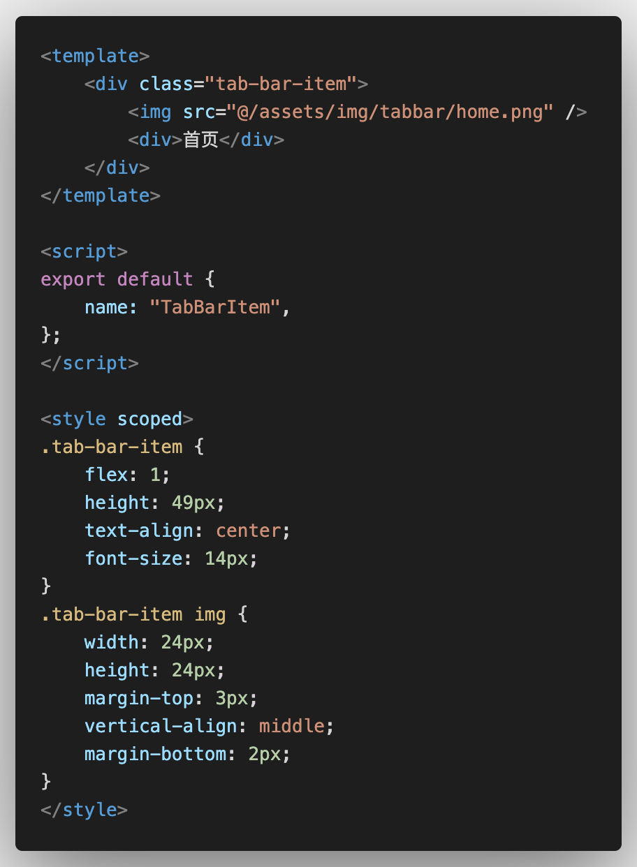 然后在 APP 组件中导入 TabBarItem 组件,如下图所示: 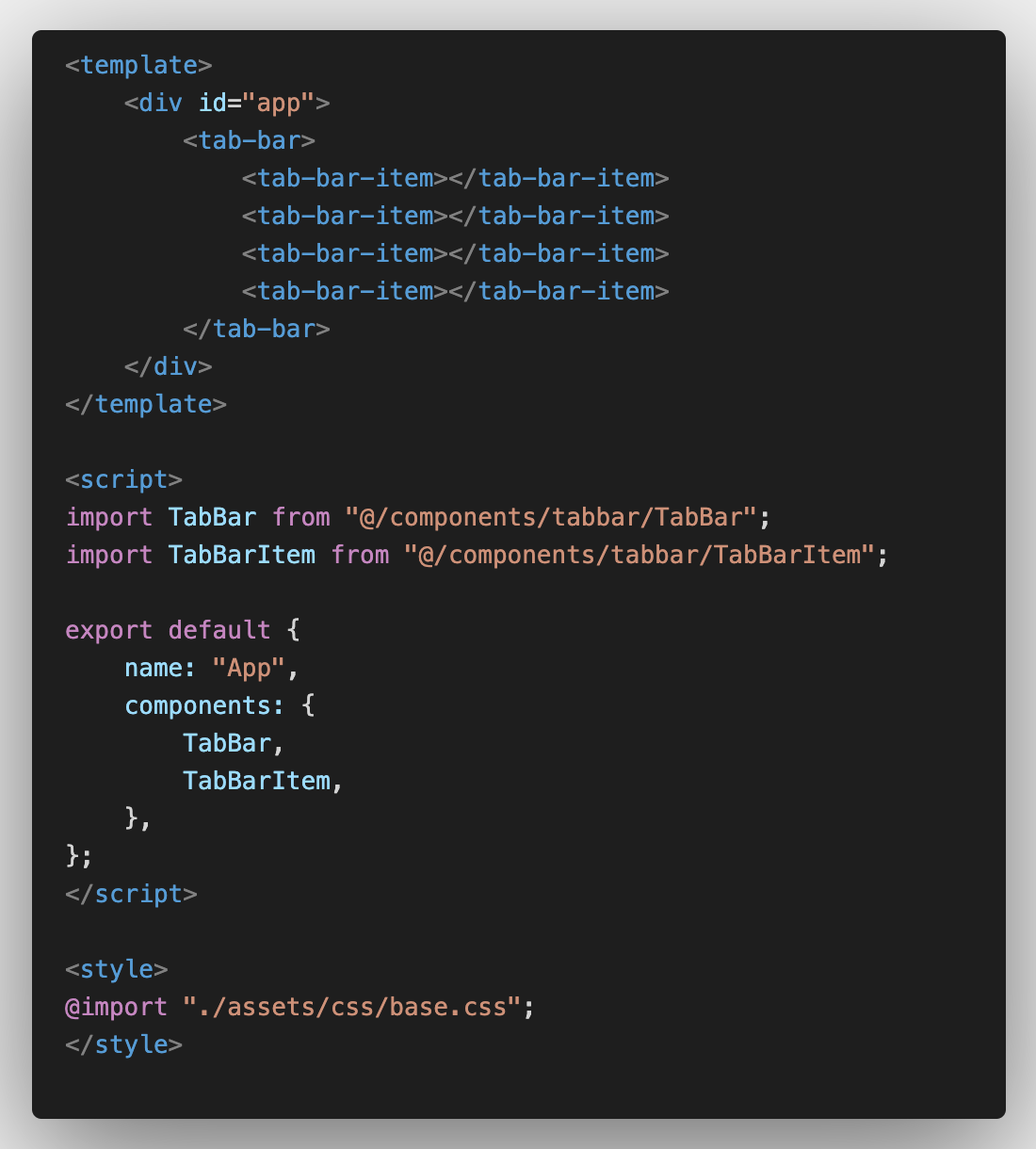 现在 TabBarItem 组件是抽离出来了,但组件内容还是死的,需要在 TabBarItem 组件中也定义插槽 ```html <template> <div class="tab-bar-item"> <slot name="item-icon"></slot> <slot name="item-text"></slot> </div> </template> ``` 然后 APP 组件就可以像下面这样写了 ```html <tab-bar-item> <img slot="item-icon" src="@/assets/img/tabbar/home.png" /> <div slot="item-text">首页</div> </tab-bar-item> ``` #### 7. 给 TabBarItem 组件传入选中时的图片 --- 当前组件中只有一个传图片的插槽,需要在添加一个传菜单选中时图片的插槽 (item-icon-active) ```html <template> <div class="tab-bar-item"> <slot name="item-icon"></slot> <slot name="item-icon-active"></slot> <slot name="item-text"></slot> </div> </template> ``` APP 组件 ```html <tab-bar-item> <img slot="item-icon" src="@/assets/img/tabbar/home.png" /> <img slot="item-icon-active" src="@/assets/img/tabbar/home-active.png"/> <div slot="item-text">首页</div> </tab-bar-item> ``` 当前效果 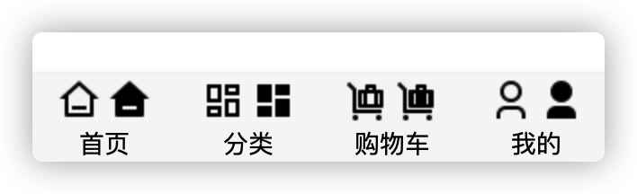 此时我们需要添加个 isActive 数据,代表菜单选中状态, 调整 TabBarItem 组件 ```html <template> <div class="tab-bar-item"> <div v-if="!isActive"> <slot name="item-icon"></slot> </div> <div v-else> <slot name="item-icon-active"></slot> </div> <div :class="{ active: isActive }"> <slot name="item-text"></slot> </div> </div> </template> ``` ``` data() { return { isActive: false, }; }, ``` ```css .active { color: red; } ``` #### 8. TabBarItem 组件和路由结合效果 --- 创建底部菜单对应的组件: 首页、分类、购物车、我的 ``` <template> <h2>首页</h2> </template> <script> export default { name: "Home", }; </script> <style scoped> </style> ``` 添加路由映射配置: **src/router/index.js** ```javascript const routes = [ { path: "/home", component: () => import('@/views/home/Home') }, { path: "/category", component: () => import('@/views/category/Category') }, { path: "/cart", component: () => import('@/views/cart/Cart') }, { path: "/profile", component: () => import('@/views/profile/Profile') }, ] ``` TabBarItem 组件 props 属性定义个 path 用于接收菜单路由, 并且给菜单容器绑定一个点击事件 ```html <div class="tab-bar-item" @click="itemClick"></div> ``` ```javascript export default { name: "TabBarItem", props: { path: String, }, data() { return { // isActive: false, }; }, computed: { isActive() { return this.$route.path.indexOf(this.path) !== -1; }, }, methods: { itemClick() { if (this.path !== this.$route.path) { // 路由跳转 this.$router.push(this.path); } }, }, }; ``` 调整APP 组件,将菜单路由用 path 属性传给子组件,并且 router-view 组件将路由组件内容渲染出来 ```html <tab-bar> <tab-bar-item path="/home"></tab-bar-item> </tab-bar> <router-view></router-view> ``` #### 9. TabBarItem 组件的颜色动态控制 --- TabBarItem 组件 props 中添加 activeColor 属性用于接收菜单选中时的颜色,并且默认值为 red;添加计算属性 activeStyle ``` props: { activeColor: { type: String, default: "red", } }, computed: { activeStyle() { return this.isActive ? { color: this.activeColor } : {}; }, }, ``` 将 ```html <div :class="{active: isActive}"> <slot name="item-text"></slot> </div> ``` 改为 ```html <div :style="activeStyle"> <slot name="item-text"></slot> </div> ``` APP 组件则可以通过 activeColor 属性控制菜单选中时的颜色,省略时默认为 red ```html <tab-bar-item path="/home" activeColor="green"></tab-bar-item> ```